
Bride in Red?
“A big fat Indian wedding! I absolutely adore those. They’re so bright and happy!”
When I describe the rituals of a seven-day, eight-event commotion of a South Asian wedding to an American crowd, the responses are monotonous and feel like a groan.
“Bright and happy” somehow feels equivalent to “exotic.”

Photo courtesy: Vogue India
The bridal couture and decor of a South Asian wedding heavily embodies bright colors as a symbol of purity. Red lehengas, emerald jewelry, blue salwars and pink kurtis, the reds, magentas, deep purples, royal golds, ashoka leaves and marigolds on veils are the points of focus in a wedding. Meanwhile, in Western cultures, shades of black and white flourish on the wedding grounds wherein white is associated with purity and wealth. Contrastingly, in South Asian cultures, these colors symbolize mourning and death.
Throughout history, Western cultures have systematically eradicated color from their lifestyles. A blue wall in a home can exist as a “statement,” but painting the entire fort cerulean would be too cartoonish. A black laced corset and mini black skirt with a bright pink handbag as a pop of color is a major win, but an entire dress in Barbie pink would be too bold.
The presence of color in the things we buy is reined in. Color is acceptable in moderate doses, but a solid fill is often a call for dismissal on the grounds of “tackiness.” This fear — manifesting in the constant effort to paint the world white — brings me to the question: Despite seeing color everywhere, why does the West suppress it?
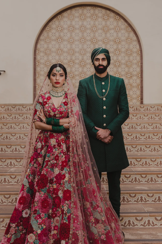
Photo courtesy: Vogue India
The rise of neutrals (think plain shelves, white sculptural chandeliers and beige couches) comes with the trend of “quiet luxury” in fashion. Meant to emphasize quality over quantity, this trend quickly became all powerful in its ability to emboss white and beige tones over every trouser, purse, shoe and shirt produced. A quick Google search for “classy aesthetic” now brings a myriad of neutral clothing options. Quiet luxury was supposed to index perfect craftsmanship and unrivaled quality, devoid of obvious brand labels —but over the years, it’s become defined by its association with neutral colors.

Photo courtesy: Vogue
Now, neutrals are the hottest ticket items in every retail store. Everyone in the front row, from Sadie Sink to Naomi Campbell, wore either white or black to the New York Fashion Week, embodying the essence of quiet luxury.

Photo courtesy: Vogue
Western culture transitioned from being on good terms with color to laughing in its face. There is an element of superficiality in the minds of the West when they create an association with color. Why is pink too much? Why is white becoming so generalized? Why is there a fear of falling into excess?
It’s okay to lose yourself in color once in a while. It's okay to say to yourself: That teal backsplash is beautiful; that orange couch won’t be a pity in a year. Life isn’t always pure and clean. Life isn’t a grotesque embarrassment to cover in shades of white. Life is colorful, with shades revealed when you embrace the uncertainty that comes with every passing day — so let color into your wardrobe, too.
Strike out,
Writer: Naomi Patel
Editor: Olivia Hansen
Graphic: Anabel Dent
Gainesville
Naomi Patel is a writer for Strike Magazine GNV. When she isn’t crying over the most mundane things, she spends her time crouched inside the laptop at Library West, pursuing retail therapy diligently, or baking things she wouldn’t eat. You can reach out to her at naomipatel0322@gmail.com.