How Your Spotify Can Become an Art Museum With the Right Covers
Image Courtesy: Strike UF
You’ve finally done it. You’ve curated the perfect playlist. It contains a precise number of songs and a diverse mix of genres. It flows from start to finish, performing a seamless symphony of sounds.
You are seconds away from proudly publishing your unique creation onto your Spotify profile when you let out a defeated sigh. The finger you had hovering over your laptop’s keypad falters.
You don’t have a cover.
Choosing to make a playlist public is bold, but doing so without a cover? A sin. Otherwise, the cover is nothing more than a soulless symmetrical grid with four squares that merely display the first four artists on the playlist. Finding the image that captures the feel of the entire playlist is just as, if not more, challenging than finding the right songs.
But the task is not impossible. And art can help.
From medieval to modern, every century embodies different eras of art characterized by artists who pioneered styles and pieces that now adorn museums around the world.
Music, like art, is fluid. It’s open to interpretation; it’s intangible, yet it possesses the power to inspire ideas and evoke emotions. Simply put, they’re beautiful. Why not combine the two? Well, we did.
Fear not if you’re not an art historian. We’ve done the digging, so after you’ve done the curating, keep reading to find out how you can draw inspiration from different art eras to take your Spotify playlists from mundane to museum-worthy.
Heartache Playlists
Whether public or private, we all have one of these. If you don’t, you should (or you can wipe your tears to the sound of Strike UF’s “love letters” playlist).
While heartbreak manifests differently for everyone, some songs and artists are universal. These playlists might feature TV Girl, Conan Gray, BENEE, Maya Delilah, Phoebe Bridgers and the like. Whatever feelings arise from listening to this set of songs about relationships (or situationships) that are no longer, a cover can seal your heartbreak anthems together.
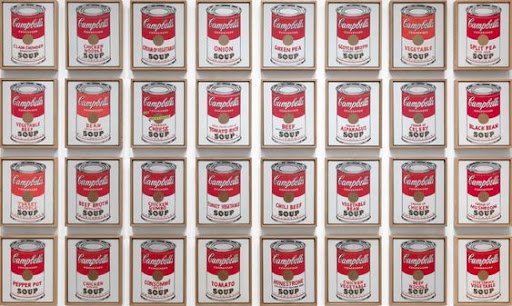
The 1960s pop art era holds the key to your heartbreak cover art. Pop art was about finding beauty in the bland, as seen in famous examples like Andy Warhol’s “Campbell’s Soup Cans,” which depicts 32 soup cans painted exactly as they are in identical columns and rows. Artists of this era plucked normal objects — and even people — out of the fast-paced world and deemed them essential to art and life.
In the same way, a crush, a breakup or any kind of unrequited love is part of life. But that doesn’t diminish the pain.
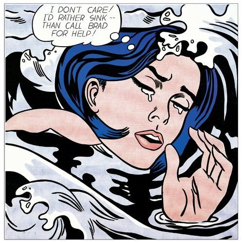
Pop art is simple but bright. It’s colorful and incandescent. It’s flashy and bold, but it maintains composure. Allow pop art to propagate your heartache playlist cover inspiration. In addition to Andy, look to creators like Roy Lichtenstein and Keith Haring whose seemingly simple work can comfort your complex emotions.
Who knows, maybe it will take your mind off whoever you’re shedding tears over, at least for a little while.
Happy, Feel-good Playlists
You’re walking to class on a sunny, 65-degree day. You’re in the car with friends, the windows are rolled down, and you’re cruising down the highway, en route to your version of paradise. Or You’re dancing alone in your room, the clothes you intended to fold crumpled on the floor. As the places vary, the music is constant: behind all of these scenes is your happy, feel-good playlist.
These setlists can be vast. Upbeat songs with positive lyrics generally make the cut, so we’re talking Saint Motel, Early Eyes, boy pablo and COIN. Whatever puts an extra pep in your step, induces a grin that sticks to your face all day or makes you pretend like you are the main character in a coming-of-age film, it all has a home in this kind of playlist.
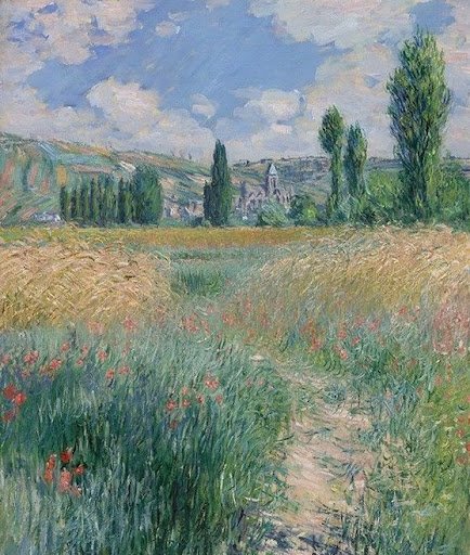
Impressionism will expertly echo the carefree moods of the feel-good playlist. The style emerged in the mid-1800s, and you’re probably more familiar with it than you think. Impressionist creations typically depict scenes of life with broken brush strokes, bright colors and beautiful craftsmanship. The paintbrush strokes are intentionally small to create a fluttery effect that immerses viewers into an otherworldly version of their day-to-day lives.
Beauty exists everywhere in our everyday existence — we just have to find it. Impressionist painters, like Claude Monet and Pierre-Auguste Renoir, certainly did.
Many impressionist paintings depict natural landscapes and were even painted outside. The light hues and languid flow of these creations exude an effortless and calming effect, much like the tunes of your good vibes playlist.
Whether you’re jamming “Near the Lake,” dancing down a “Path on the Island of Saint Martin, Vétheuil,” or feeling good anywhere in between, find inspiration in impressionism and joy in your natural surroundings.
Experimental Playlists
It’s 3 a.m. Everyone else is asleep. The fluorescent light from your phone screen won’t soothe your insomnia, but you need something to sooth your thoughts.Your go-to hodge-podge playlist of varying genres and sounds comes to the rescue.
These playlists are like junk drawers. They’re composed of “weird,” often indie, songs with lyrics that cease to make sense. They’re bound to grooves and feelings instead of genres. Nonetheless, it’s a cherished playlist, and it deserves a proper cover just the same.
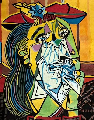
Cubism warps reality into an abstract universe – and that’s the beauty of it. The avant-garde style revolutionized the art world in the early 1900s, with Pablo Picasso being one of the primary pioneers.
In twisting and turning shapes, cubism depicts subjects in skewed perspectives and new dimensions. It stretches our definition “normal,” leaving our imagination to piece together the creation in front of us.
Do the same with your experimental playlist. Your tracks and artists might have bizarre sounds and names, but what does it matter if you enjoy them? Embrace eccentric art. Find wonder in the weird. Own your playlist’s peculiarity with a cubist cover.
Workout Playlists
It’s a Saturday morning and you’ve decided to conquer the world. Perhaps you’re smashing through the final mile of your long run as BROCKHAMPTON blares in your ears, pushing you to press on. Maybe your favorite rock band is guiding you along a hiking trail. Or, perhaps, you’re listening to techno music as you trek through your workout.
Sweat sessions are personal, which means there’s no right or wrong way to exercise. But there is a right way to seek inspiration for your workout playlist cover, and that’s through surrealism.
In the early 1900s, surrealism was born from a desire to capture the imagination and how it intertwines with our unconscious. These pieces don’t just stick to the magical, seamless daydream scenarios we use as distractions during the day. Surrealist art can be terrifying, as it can dig deep into the fabrics of who we are as individuals and as human beings as a whole.
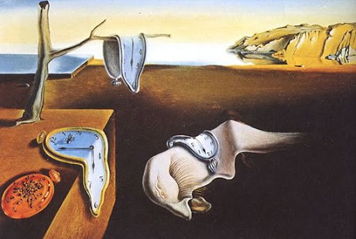
Salvador Dalí and René Magritte, two trailblazing surrealists, would paint headless animals and people soaring through the sky, or any other optical illusions that make any viewer’s head spin. Their work and the creations of other surrealist artists is innovative and jarring; spontaneous and bizarre.
Working out is not and should not be a one-stop shop to receive one result. Our physical and emotional needs and wants are all different, and that’s a good thing. In the same way, the perception of a surrealist painting is going to differ among an audience, creating a unique experience for every viewer.
Everyone’s perspective on the meaning behind a surrealist work of art is different, which is exactly what makes the mode of art so revolutionary. The same could be said about exercise and the songs that pump you up to do it. It doesn’t hurt that a lot of Dali’s paintings appear as if they’re melting, too.
The time has come for you to revitalize your Spotify playlist covers. The images you took from Tumblr just aren’t cutting it anymore. Why not dig into the art scene and draw upon the work of famous artists? After all, music is a mode of art just as much as a 19th century painting hanging in New York’s Museum of Modern Art is, and combining the two will set your own Spotify “museum'' apart.
Strike Out,
Writer: Abigail Hasebroock
Editor: Kate Corcoran
Graphics: Claire Federico
Gainesville


